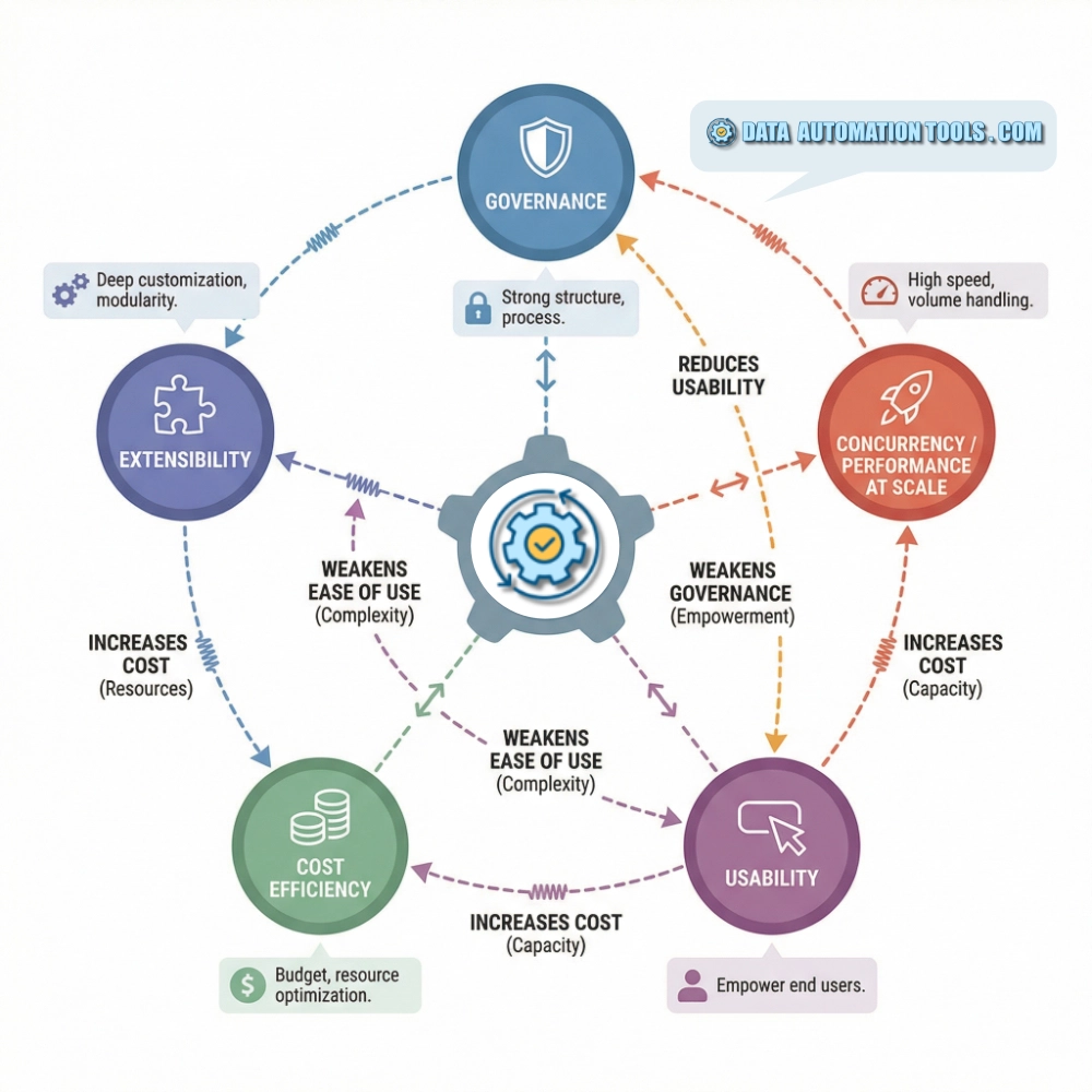
The question of which is the best data analysis tool – and this is something the vendors won’t tell you – is a question without an answer. As I said in my survey piece, Overview of Data Analysis Tools, what makes one tool better than another is a combination of five qualities: governance, concurrency, simplicity, extensability, and cost. This simple list begs the question: which tool (or tools) capably checks all these boxes? The answer is: none of them.
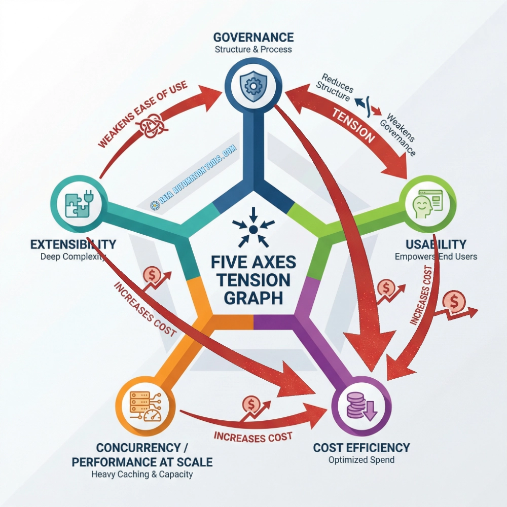
The reason this question lacks a satisfying answer is because those five qualities aren’t a list you check off, they are political/phiosophical choices, many in direct tension with one another. For example, a tool that absolutely crushes governance tends to lose some usability. A tool optimized for massive concurrency often sacrifices cost. A platform that’s wildly extensible usually requires more discipline to govern. You can get four of the five pretty consistently. Getting all five in spades at the same time however, is, it seems to me, at this moment in time, not possible.
And because a data analysis tool is a meaning-making machine, one that inevitably bends an organization to it’s implicit philosophical biases, it is absolutely critical that we developers choose analytics tools that fit our organizations if not like a skin-tight union suit then at least like a glove. Otherwise, the likelihood that we will suffer the effects of a slow and agonizing water torture – Chinese, not Guantanamese – is extremely high.
This unfortunate situation is one I’ve witnessed firsthand and I wouldn’t wish it on my worst enemy.
The Five Forces In Tension
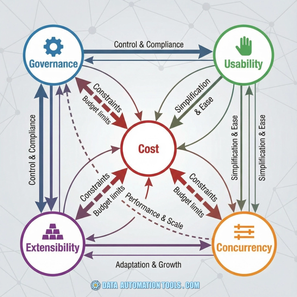
If we map these forces, the “graph” is less a pentagon and more a web of competing forces:
- Governance pulls against Usability and Extensibility
- Usability pulls against Concurrency and Cost
- Extensibility pulls against Governance, Concurrency, and Cost
- Concurrency pulls against Cost and sometimes Governance
- Cost pulls back on everything
The bad news is that if you’re in the market for the ol’ “one simple solution” trick of the perfect data analysis tool, or even the best data analysis tool, you won’t find it.
There is however, something of a sideways solution, though it’s not one that I’ve ever heard a vendor admit. But I don’t want to spoil all the fun. First the foreplay!
The Contenders
If we judge by balance across all five dimensions rather than absolute dominance in any one, there are really only three tools that seriously contend. Power BI, Looker, and Tableau stand out as the only tools that realistically wrestle all five core tensions at once: governance, usability, extensibility, concurrency, and cost.
These three, each in their own way, represent a credible attempt at balance. Power BI leans into accessibility and price without abandoning enterprise controls. Looker prioritizes governance and extensibility while still delivering usable workflows at scale. Tableau emphasizes exploration and user experience without completely sacrificing structure.
None of them wins every tradeoff, but each has proven capable of operating in complex organizations where real constraints collide. That rare ability to survive in the messy middle is what separates them from the many niche tools that excel only in idealized conditions.
Power BI is the closest tool to “all five” in my experience, and that seems to be the consensus among the developers I’ve had this conversation with. However, it’s got them far short of “in spades”. Power BI thrives in Microsoft-heavy environments. Its semantic models, tight integration with Excel, Azure, and Microsoft 365, and aggressive pricing make it hard to ignore.
Power BI bottom line: Power BI’s strength lies in value density: a lot of capability for the price. Its challenge lies in complexity. DAX, capacity planning, and licensing tiers can become confusing as deployments scale.

Looker built its reputation on one big idea: metrics should be defined in code and reused everywhere and pushes teams to model data centrally. When this works, it’s powerful. Looker rewards organizations willing to invest in data modeling as an discipline, not an afterthought. Pricing tends to be enterprise-oriented
Looker Bottom Line: If governance is your top priority and you have a data-mature organization, Looker is the strongest “enterprise-grade” answer — but it doesn’t win on cost or broad user friendliness
Tableau became synonymous with modern BI by making data exploration visual and immediate, which has made it the default choice for organizations that wanted people looking at data, not just reading reports. This strength is also its greatest challenge: Tableau’s strength in usability makes governance much more of a challenge.
Tableau Bottom Line: Tableau’s role-based pricing is familiar to many organizations, but managing large deployments can become complex as user counts grow.
What About The Other Data Analysis Tools?
 | Sigma‘s great on usability and extensibility for warehouse-native teams. Weaker on governance and concurrency. |
 | Qlik is strong on performance and discovery. Weak on modern extensibility and governance. |
 | Quicksight has a fantastic cost model and AWS integration. Weak on usability and extensibility lag the top-tier tools. |
 | Domo‘s great on usability and distribution. Weak on cost and governance. |
 | Alteryx is amazing for data prep and analytics workflows, but not really a pure BI platform — it lives adjacent to this question rather than inside it. |
The Only True Answer To The Question
Remember that sideways solution I mentioned above, the one I’ve never heard a vendor say out loud. The true answer to the question what’s the best data analysis tool, the tool that truly has all five qualities in spades isn’t one tool – its a stack. In other words, the “perfect data analysis tool” is a set of ecosystem design choices, not a single platform purchase.
In practice, no single analytics tool delivers governance, usability, extensibility, concurrency, and cost efficiency all by itself, which is why high-performing organizations assemble a layered stack instead of betting on one product.The combination that most often nails all five dimensions is something like:
- Data warehouse (Snowflake/BigQuery/Databricks) → concurrency & scale
- dbt or modeling layer → governance
- Power BI or Tableau for consumption → usability
- APIs / embedding layer → extensibility
- Centralized compute model → cost efficiency
A data warehouse such as Snowflake, BigQuery, or Databricks provides the foundation of elastic concurrency and scalable compute, allowing thousands of users to query massive datasets without collapsing under load. On top of that, a modeling layer like dbt introduces disciplined transformations, reusable metrics, and version-controlled logic, creating the governance backbone that keeps definitions consistent. Visualization platforms such as Power BI or Tableau then handle the human side of the equation, offering polished, intuitive interfaces that make insights accessible to everyday users. APIs and embedding frameworks add extensibility, enabling analytics to flow into applications, portals, and workflows beyond the dashboard. Finally, centralizing compute inside the warehouse ensures that processing happens once in a controlled environment, avoiding duplicate pipelines and extracts and delivering the cost efficiency that ties the entire architecture together.
It Isn’t Only About The Features
Every tool on this list can produce charts, dashboards, and reports. The real differentiators are governance philosophy, cost structure, and how well the tool matches how people actually work. Some organizations need strict metric control. Others need fast exploration. Some have thousands of casual viewers. Others have a small group of highly technical analysts. Some live entirely in the cloud. Others straddle legacy systems.
The “best” data analysis tools are rarely the most powerful ones. It’s the ones that aligns incentives—between analysts, engineers, executives, and finance—without turning analytics into a constant negotiation.
When data analysis tools work, they fade into the background and quietly inform decisions. When they don’t, they become the loudest voice in the room. And that, more than chart aesthetics or query speed, is what separates the winners from the rest.
Data Analysis Tools Recommender
Based on the analysis above, I built this nifty data analysis tool analysis tool to help you get a sense of which data analysis tool platform might be best for your organization. This recommender helps turn those 5 tensions (governance, concurrence, usability, extensibility, & cost) into practical decisions that the tool recommender will then use to generate a tailored recommendation. The engine applies transparent rules, weights your preferences, and explains its reasoning. The result is a clear starting point for serious conversations, smarter evaluations, and better long-term technology choices that fit how your organization actually works.
Lastly, the tool is free and anonymous. While I of course log the entries (which has been instrumental in informing the above analysis and helps me tweak the tool – a beautiful positive feedback loop if I do say so myself), there is no identifying information attached to your inputs.